'the works'

I Design Therefore I Am!

Wednesday 27 July 2011

Corporate Identity for Art Gallery


                                          (click to enlarge image)


We redesigned the identity for Bangkok Art and Culture Center for one of the courses. I struggled quite a bit to come up with the logo and this is definitely not one that I'm crazy about. Nevertheless, learned a tremendous amount about corporate identity, specifications and printing disasters throughout the making of the project!

Saturday 2 July 2011

The Corpse Bride's Coffin Room


We were to make a 3d paper model of a scene from a movie. So I thought it would be best to stick to
animation and rushed to the Tim Burton collection! This is a scene from Tim Burton's Corpse Bride, right after the hero is sucked into the hell beneath the ground and is running around trying to find his way out when he lands in this room full of coffins and cobwebs which further adds to his dismay.

Wednesday 30 March 2011

Packaging for Hair and Body Care Products


We were to design packages for 5 products from Royal Chitralada's array of products. For my personal concerns for skin and especially hair, I chose to design the labels for their herbal line of shampoo, conditioner, hair treatment, shower cream and soap. The illustration portrays the organic and natural roots of the prodtucts' ingredients. And really wanted to work with black and white so kept it clean and solid colored.

Saturday 5 March 2011

Illustrating Children's Book


This one is about a little boy who loves to paint and draw adding color to everything that needs some. One night he goes to bed and finds himself riding a gigantic paint brush adding color to the white moon and the clouds and the river water and everything that contained in his imagination. The next day he finds out, it was only a dream! :o

Monday 21 February 2011

Saving in Showers!


Infographics: smart creative way to exhibit information facts and figures that can be easily comprehended. Here it shows how much water is wasted in showers and what we can do about it

Thursday 17 February 2011

T-shirt in a Box


The assignment required us to make a package and t-shirt for a niche market. So I thought why not make something for "people like us," a package that is covered in inspiration from quotes, color, big typeface. The box can be flipped so that both sides can be used.

Saturday 18 September 2010

the essence of the type


We were told in class to design a new typeface that would take characteristics from another 
language's typeface. Here the english letters are inspired from the Bangla alphabets. The 
thick and thin strokes, the angled stems and the circular ears of the english fonts derive from 
that of Bangla. Hope you guys like this one...after a long long time I actually 
enjoyed staying up late to make something!

Thursday 19 August 2010

covering the books


Vector Self-Portrait!


This is rather funny looking. A smiling pirate! Had to be a self portrait on a fictitious character and so here's a blend of Jack Sparrow and my smiling face.

Saturday 24 July 2010

___Secret Glances___


Photography, Photoshop = Postcards

Friday 11 June 2010

RHEEE-WORK!


Rhee  :  http://www.facebook.com/pages/Dhaka-Bangladesh/Rhee/6892666724?v=info&ref=search


Sunday 11 April 2010

people and their type face

(click to enlarge)

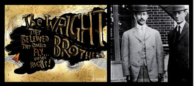
We were assigned to pick a historical figure...figures in this case, and create come up with a saying to go with them, and in the process design the typeface for their name and the phrase that reflects them as people, also the time period. And here's what I came up with. :)

Thursday 1 April 2010

Photoshop tricks


A school project required us to take pictures of our class mates and clone their faces in an already existing movie poster. The result goes as shown above on the second image! (click on the image to enlarge)


Monday 8 March 2010

Type as Image and Image as Type


Type as Image:  The word 'discrimination' addresses a social problem of gender discrimination that is faced by women in the sub-continent. Here the play of letters signify the specific issue.
(click above to see the full image)


Image as Type:  Type is used in a manner where it represents trees and encourages people to plant as more and more are being cut down from the face of the earth

Pointilism


Orchestrating the Infinite
pen illustration

Packaging


Packaging for a fruit juice 

Breaking, Fracturing, Layering Typeface


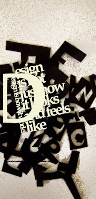
This project required us to pick quotes about art and design and play around with the typeface so we can distort, fracture, separate them to create a piece of artwork. The emphasis was not on legibility so we could experiment with the words and the message of the quotes.


Advertisements for Sony PlayStation Portable


Promotional poster for Linotype typeface: Garamond


These promotional posters layouts are to advertise the classic font 'Garamond' and therefore, consists a bit of its history, samples of its different forms such as bold, italics, etc. and also specifies some of its characteristics as old style serif font